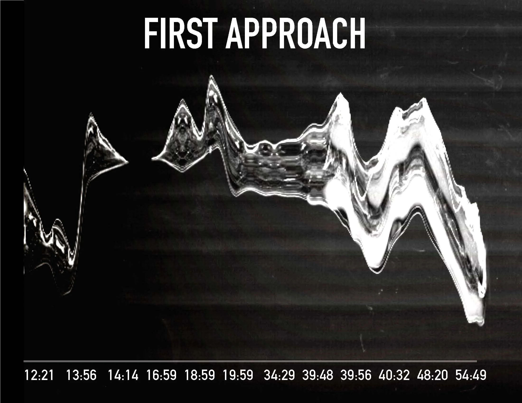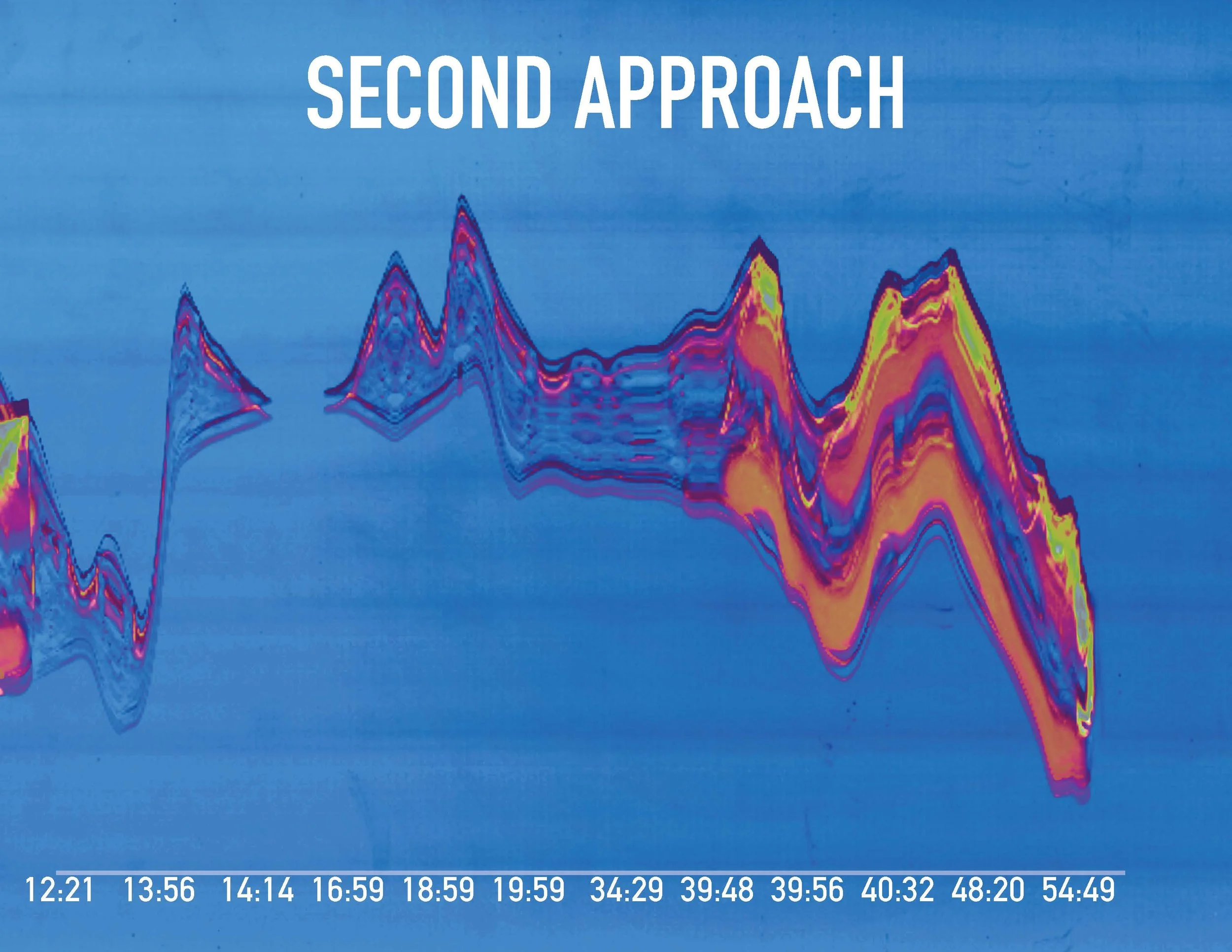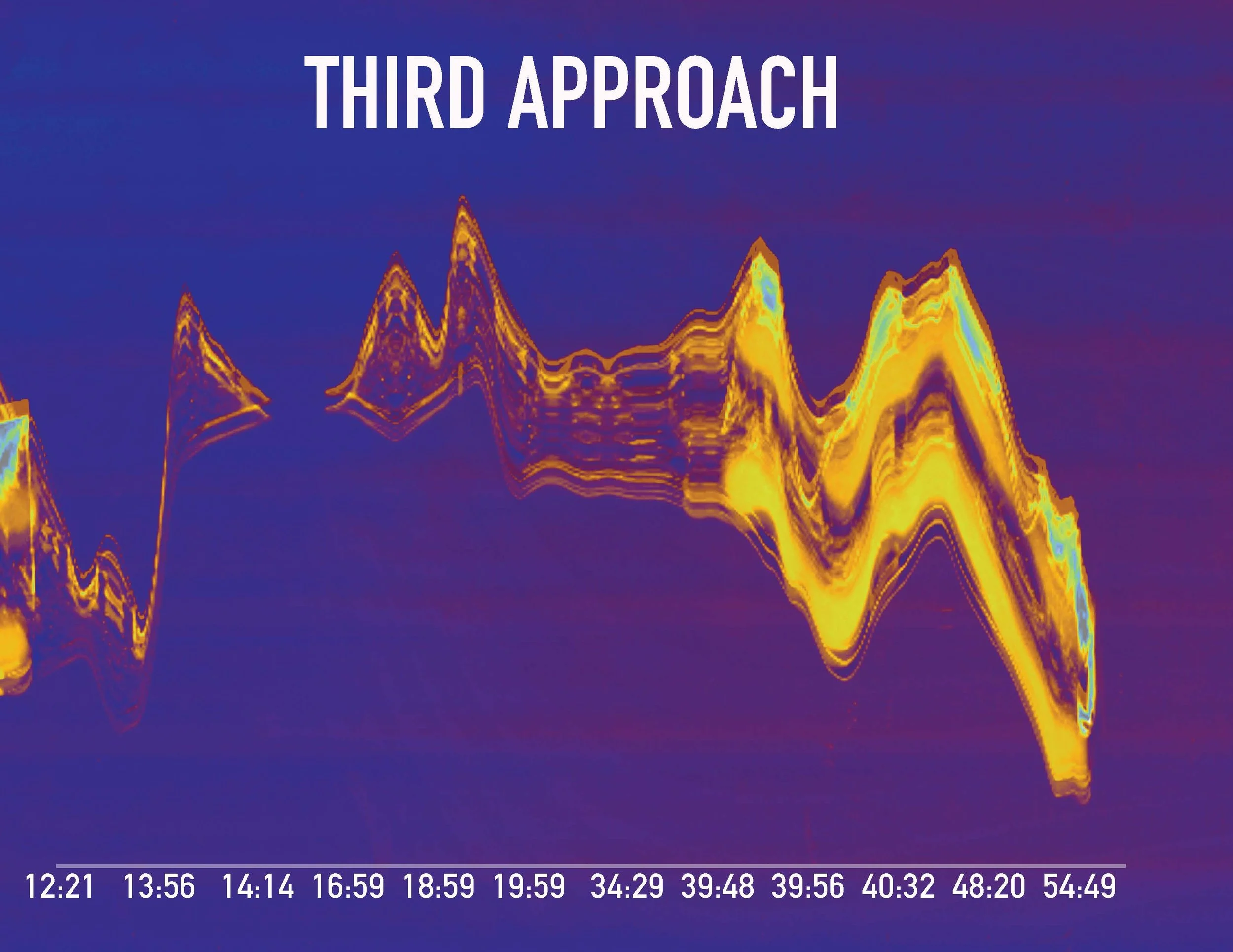
Infographic
UI/UX

When watching a film, it is important to realize that everything you see on screen is a kind of code that is used by the filmmakers to tell the story. Every word, color, sound, movement, composition, and set piece is an intentional decision made by the filmmakers to help build the world of the film, and tell the narrative in an interesting and expressive way. I observed how the story was told in an experimental yet expressive way. By focusing on 4 main elements of the movie, I created a map as an infographic design system to display how I interpreted the movie.
My idea was to focus only on how the movie was confusing- the dialogue, the action, the different settings and how they all don't make sense until you watch the very end. That is the beauty of it. Nothing was clear in itself. By being ironic, I wanted to use clear pieces of paper but create experimental designs by scanning with (plastic and yes, a toilet paper roll) to express the abstraction and confusion of the movie in the best way possible.


EACH APPROACH OF ADAPTATION is shown below. the bottom axis indicates the time frames per second while the graph in general shows the intensity of the action from each time frame. THE FIRST TIME WAS BLACK AND WHITE, CHAOTIC AND CONFUSING. THE SECOND TIME, THE COLORS STARTED TO SLOWLY TANGLE INTO THE PLOT MAKING A MORE CLEARER UNDERSTANDING. THE THIRD AND LAST APPROACH, I FINALLY UNDERSTOOD the dialogue but things were still incredibly abstract.


